You have created an ad for your special winter clothing sale. You’ve finalized on all the pictures, the dates for the roll out, and more. However, wait a second! What’s the most important aspect of your ad which can either make it or break it? It is the content off course, and more specifically, it’s the Call to Action (CTA) buttons.
Call to Action buttons are critical, as they help you, move your potential consumers to the final stage, and makes them buy from you, online.
Digital design and UIs are evolving at an incredible pace, and the styling of buttons along with them. The Dribbble Button Timeline shows how the click to action button styles have evolved over the past decade.
Navigation is one of the most important elements of a good web design, and the Call to Action button is its strongest tool.

What are Call To Action Buttons?

A Call to Action (CTA) is a prompt on a website that tells the users to take some specified action. A Call to Action is typically written as a command or an action phrase, such as ‘Sign Up’ or ‘Buy Now’, and generally takes the form of a button or a hyperlink.
Call to Action or CTA buttons are digital buttons that urges you to take action, and to do something, basis the objective of the marketer. These buttons are mostly seen in advertisements, web pages, and on other forms of online content.
Call To Action Buttons and Marketing

There’s a lot that goes into these Call to Action buttons, be it your website or even on Facebook, Instagram, LinkedIn, and other digital platforms.
In addition to being clear as to what to write on these CTA buttons, the copywriters, are also aware of the other aspects that might equally weigh in the success or failure of your ads, web pages, etc. where these buttons are placed.
As per a Neil Patel’s article, Call to Action buttons motivate the visitors psychologically. When visitors land on your ad, website, etc. they expect to see a CTA button that communicates something of value to them. These buttons, thus motivate them to take some action, depending on your objective.
Now, off course, this does not necessarily mean that the visitor would definitely take the desired action, nevertheless, at the same time, the visitor does interpret the information that is presented in front of him, and now knows what to expect, basis what’s communicated on the CTA button.
This is traced back to a psychology theory called perceptual set theory. Perceptual set theory stresses the idea of perception as an active process involving selection, inference, and interpretation (known as top-down processing). It has 3 base stages.
The first, selection. Here, you easily notice what’s providing you visual appeal. So an animated CTA button with bright colours? Well, that’s likely to catch your attention.
The second, inference. In this, there’s an experience or a memory that traces to the past, and is similar to what you see right now in front of you.
Eg. If you click on a button that says, “Add to Cart”, you know there’s a virtual cart or list out there, where you’re adding all the items that you want, before you go ahead, and make the purchase.
The third, and final stage, interpretation. Here you’re interpreting a combination of the first two stages to perceive something the way you do. Interesting right? Well, that’s exactly how all these Call to Action buttons work for marketing.
Click to action buttons capture your attention, and motivate you, and give you a fair idea of what to expect, or better yet, understand what would be on the other side, once you click on that button.
However, here’s an unfortunate truth. About 70% of small B2B websites still do not use the Call to Action buttons, sufficiently.
This means that your business loses out a lot, simply because you are not clearly communicating with your potential consumers, as to what exactly they could expect from your business or from your services. And, the last thing that you would want now, is to lose out on leads due to poor communication.
CTA buttons on your website, and on your Facebook, Instagram, Twitter, LinkedIn, and on your other handles, and platforms are critical. For instance, adding a Call to Action button to your Facebook page would help your business gain exposure, and could increase the click-through rates by 285%.
Importance of Call To Action Buttons

While you may have already noticed these Call to Action buttons on ads, and websites, and almost everywhere today, and also why they’re so relevant in marketing, they’re super important for a number of other reasons too.
According to Vizion, Call to Action buttons are motivational in nature for your audience.
CTA buttons provide that determining step, that converts your leads to customers with a click. CTA buttons is a critical factor in all your Ad Campaigns, that you may run on any platform be it your website, social media or search engines.
If your business doesn’t pay much heed to these Call to Action buttons, then this would be a grave mistake that could cost you a lot. As your visitors view your content, your CTA buttons simultaneously need to communicate with them, and convert them into leads.
Visitors too in turn are used to these Call to Action buttons. And, if you don’t carry these Call to Action buttons, it would then send the visitors to a state of confusion, making them wonder, as to what they should do next.
Now, you don’t want that, do you? In a way, your visitors too, are expecting these CTA buttons.
When you’re focusing on your copy, you want your communication to be simple, and quite easy to comprehend, for your target audience. With a clear Call to Action button, you’re not only capturing the attention of your audience but also conveying – “Hey! Let’s seal the deal?”
CTA Buttons Stats

- As per Unbounce, more than 90% of visitors who read your headline, also took the time to read your Call to Action button copy.
- Wordstream found that when a single Call to Action was added to emails, conversion rates increased. Clicks were up 371%, and sales went up by 1617%.
- To get more clicks on a video, KISSMetrics observed that when they added a Call to Action button, they got 380% more clicks, vis-a-vis the side bar that they used previously. In addition to this, it also turned out that the correct placement of these Call to Action buttons also helped further.
- When placed on Welcome Gates, the conversion rates were highest at 10% to 25%, followed by conversions rates at Feature Boxes with 3% to 9%, and then followed by Pop Ups with 1% to 8% conversions.
- Clickthrough rates had been impacted positively after adding social sharing CTAs to emails. This was particularly observed for Social Times. Social Time’s clickthrough rates or CTR rose up by 158%.
Types of Call To Action Buttons
Lead Generation

In the lead generation type of a Call to Action button, you would see words like, “Download Now For Free”, “Get Exclusive Ebook”, etc. The text here captivates the audience, and entices them to a valuable offering. The goal here is to transform the casual visitor into a serious lead who could then be pursued later.
In such scenarios, these types of buttons are generally placed by the owner or the web designers, on pages that receive the highest volume of traffic. Remember, the objective here is, for the potential consumers to find exactly what they expect, after they click that button.
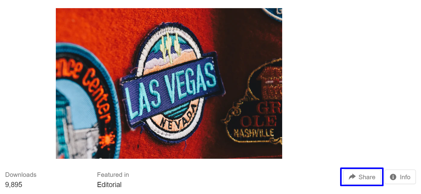
You would have noticed the “Share” button on many different posts in the social media platforms that you use, such as Facebook and LinkedIn. The button does exactly as the name suggests, it encourages the visitor to share a piece of content on their own social media handle.
Thus as a business, you should pay heed to this, and post appropriate, and relevant sharable content.
Read More
Did you read something super interesting on Instagram, and then towards the end you came across the words “Full Story on the link in the Bio.” Did you not wish, that instead there was a button that simply said “Read More” or “Continue Reading”?

Moreover, you can’t have an entire post or a lengthy article on a homepage, so to promote your content you can always add the “Read More” or “Continue Reading” button.
Product Study

Often, visitors would not want to purchase your products or services in the very first go. In such scenarios, you should make it, as easy as possible, for your target audience to navigate through your website, and understand the products, and services that you offer.
Hence, you should add a Call to Action button that directs your users to more information about your products, and services. Although, “Learn More,” sounds similar to “Read More”, it’s different as this CTA button directs visitors to more information about your product, and service offerings.
Submit

The “Submit” Call to Action button is very simple, and is generally intended for submission of forms. You would have noticed this button, after you had completed filling up the details, say on a Google form.

However, the “Submit” button can seem all too boring for your website visitor. And, you don’t want to miss out on a lead or a conversion. Thus, the best solution is to replace this “Submit” button text with some other captivating text, that’s more in sync with what you have to offer.
Nurture Leads

So what do you do if your target audience is still not ready to give into what you’re offering? Come up with another offering, or tweak your offering that could prod them to think about you a little more! It could be a free quote, a free trial, or even a demo version of your product, etc.
Give them some benefit, as part of a glimpse of what they’d get if they take the entire package. Click to action buttons such as “Get a Free Trail”, “Take a Demo”, etc, do the trick here.
Sales Focused

After you spend all your energy, and resources on generating leads, and nurturing them, you need to ideate, and decide on the perfect CTA/s to close those leads. This would mean converting them from leads to consumers.
For this, you should have CTAs that are sales focussed. You can place them on the product pages, and such other web pages that are focused on these products or services.
This would help the potential consumers as they too get time, and space to do their own research, and get back to you, after they’re convinced. Some of these buttons are “Buy Now”, “Order Now”, “Add to Cart”, “Contact Sales”, etc.
Promotions

Planning on having a live event online or offline? Then run a promotion that would help you get the max attendance, with Call to Action buttons, that are focused on this objective in particular. You can start a promotion to raise awareness about the event, and thus gain momentum for the event.
Click to action buttons for promotions don’t have a set place and can be placed anywhere, your home page or even your thank you page, i.e. even after the visitor, now turned customer has made the payment for your product or service.
Call To Action Buttons Best Practices
Let’s dive in, and understand the best practices for Call to Action buttons.
Use Right Words

Any Call to Action button that has ever captivated you because of what was written on the button? Well, you’re not the only one who’s attention this button would have caught. Statistically speaking, based on how it relates to your target audience, the right text on your Call to Action button, could be highly impactful.
It’s understandable that you’d want your communication to be clear. Furthermore, get rid of the boring words. Use action packed words instead!
Here’s a list of boring words.
- Submit
- Try
- Reserve
Examples of bringing life to your Call to Action buttons text.
- Try out the free demo
- Start a trial & download PDF for free
- Reserve your tickets today
Button Design: Shape and Colour

Apart from the text, button design matters. The Call to Action buttons color, shape, and the overall design is also what’s responsible for getting you quality leads. First, let’s look at the color of the button. Your Call to Action buttons color actually matters a lot more, than what you think.

Colors are known to trigger certain emotions in humans. According to Very Well Mind, green stimulates the body, and increases blood circulation throughout the body, while orange is known to increase energy levels. Thus as per Wordstream, green, and orange Call to Action buttons are known to perform best.
However, remember this also depends on the contrasting colors on your website, and on other factors. And if you’re trying this out for the first few times, do run an A/B test which would help you understand what your target audience prefers.
The second factor is the button size. Smashing Magazine states that the button size also plays an equally important role in marketing your Call to Action buttons. They recommend having the Call to Action button bigger than the logo on your website.
Now, this is especially applicable for website CTAs. For example, on Lifetree Creative Marketing website their “Free Quote Download” button is bigger than their logo on the website. As a result, visitors would directly view the offer, and the Call to Action button first, before anything else on the website.
In web pages, the size of an element relative to its surrounding elements indicates its importance: the larger the element is, the more important it is. Decide how vital certain site actions are, and size your Call to Action buttons accordingly.
Third, it’s recommended to use responsive design. That is you should consider the fact that most of your website visitors or ad viewers are seeing it on their mobile phones. Hence, you need to adapt accordingly. Double check what your Call to Action button looks like on different screen sizes.
Last, pay attention to the shape of the Call to Action buttons. The shape of the button would also be a factor in attracting the attention of your audience.
Here are a few tips offered by GoSquared.
- Choose a bold color for your buttons.
- Ensure you have good contrast between text, and button color.
- Use a bigger font size, and a legible font.
- Choose a solid, attractive shape for your buttons.
- Rectangle buttons should have ample padding around the button copy.
- Rounding the corners of the button helps the user visualize the start, and the end of the button.
- Adding a shadow to buttons, could help the shape “pop” off the page, and float above the background clearly.
- A block background rather than just a border would help the button to stand out.
- Mobile and desktop optimized Call to Action buttons.
- Put your Call to Action buttons above the fold.
- Remove choices.
- When to repeat your Call-to-Action buttons on a page.
- Always be testing.
These tips would help you comprehend better, if your Call to Action buttons would perform well.
Easy Text Readability

In marketing, everything you do boils down to one factor – communication, and more specifically, how clearly you put forward your message to the public.
Although there are chances of confusion brewing, you need to ensure that what you communicate is clear, and concise, and there is no scope of any ambiguity, especially so with your Call to Action buttons.
Thus, apart from using simple language, ensure to check the basics – the clarity of the text and the appropriate length of the text. Overly long text could come across as something intimidating.
Talk Like It’s Important

Off course your business is super important to you, however do ensure that your CTA communication is such that it’s super important to your visitor as well. Though you might be offering them a good deal, add a certain sense of seriousness, and urgency to what you’re offering.
It’s like one of those offers that you saw online that read “50% off today only.” That must have caught your attention immediately, and you’d have given it some serious thought, before you went ahead, and closed the deal simply because it conveyed, “Hey! It’s not going to be available tomorrow.”
You too want to make your target audience feel that urgency, along with your offer being duely important. Hence, create deals with Call to Action buttons that they simply cannot refuse.
Be Concise, To The Point

Time is precious to everyone, and marketers often need to be reminded of that when they’re selling their products, and services online to their target audience.
Being able to convey your message in a crisp, and concise manner i.e. with a limited number of words, is what’s considered to be the true skills of a copywriter, and that of a digital marketer.
When you’re reaching out to your visitors about a deal, avoid beating around the bush, or else your visitor’s would lose patience, and interest, and move on to their next best option which would not be you. You obviously don’t want that.
Hence, keep your Call to Action message, short, and simple. The ideal word count for a Call to Action button is two to five words.
Use First Person Speech

When you write a Call to Action copy, be mindful, and put yourself in your target audience’s shoes. Ask yourself this over, and over again, “How would your target audience read, and take this?” Do remember, that when they read it, they always look at it from their perspective.
And the best way to communicate is through the use of first person speech. This gives a sense of personalization, and helps them to think clearly of what is being offered through the Call to Action button.
As per a study shared by Michael Vangard, when marketers changed their Call to action button, and other CTA communication from second person to first person, the clickthrough rates rose by 90%.
Thence, this change in clickthrough rates is proof that this small change from second to first person, has tremendous potential.
Above The Fold

When reading, it’s considered that the reader begins reading from the very top of the page, and then gradually scrolls down to the bottom.
As per an eye movement or eye-tracking study by Eyequant, when going through a website, the eyes first start moving from the top left corner, and then move to the bottom right at the very last, i.e. if they still continue to stick around.
Hence, do ensure that all your important information including the Call to Action buttons are placed on the very first scroll of your web page. Any other information could then be placed below the fold, on the page.
Personalize Call To Action Button Content

Everyone likes a little bit of personalization, especially so in communication. It makes them feel special, and that’s something every consumer appreciates. As per statistics, it could boost your conversion rates by around 200% or more. That’s a lot!
For personalization, you could also use information on the audience location, whether they’re a repeat or a new customer, and other relevant data points. This would help you refine, and finalize your customized, and personalized communication copy.
You could also take the aid of artificial intelligence for personalization. To learn how AI is transforming online advertising, click here.
Call To Action Button Offer

After the text, color, shape, etc. what the button is actually offering is also equally important. Are you making it worth their consideration? Additionally, words like “Free”, “Limited edition”, etc. could really grab the attention of your visitors, irrespective of their purchase intention.
Take some time to focus on the text, and the offering through it on the Call to Action button. Here’s a fun statistic, 9 in 10 people are likely to remember the name, and logo on a free giveaway.
Make Bonus Text Worth The Read

A free bonus text would mean that you’re just adding a line or two of some extra information, that adds value to the text that is already there on your Call to Action button. This is generally used as a practice for the “Free Trial” button. For eg. “10 Day Free Trial, no card info required.”
Here, it adds to what’s being offered in the Call to Action button, while still being super clear, and concise. Other practices similar to this which you could apply to your Call to Action buttons are discussed here in detail by Copybloggers.
In short they refer to these “bonus texts” as “click triggers”, and include testimonials, data points, anxiety suppressing information, and other key texts.
Limit The Choices

Less is always more when it comes to closing a sale. When you present your target audience with too many choices, they’re likely to get confused, and delay closing a sale.
If you have no other option, and need to include multiple Call to Action buttons, give a higher weightage to one button over all the others, so that it is easy for your target audience to identify, and clearly know what’s exactly at stake.
Furthermore, the rest of the Call to Action buttons on the very same, as well as on your different web pages should be less attention grabbing, such that it presents to your audience one best clear cut favorite.
Need White Space

If you want your page or your ad to look clean, ensure to leave ample white space. It may feel odd, especially if you’re not used to this, i.e. if you are used to cramming up a lot, in little space. However, you do need to get rid of that habit.
White space is good, and easy on the eyes, and makes your Call to Action button appealing, vis-a-vis a crammed up ad or website. You could also balance out the other colors.
Check Landing Pages Before Finalizing

It’s imperative that you double, and triple check your landing pages too, before you go ahead, and finalize your Call to Action buttons. Links may not be working on the buttons or on the landing pages, or the text may not be as appropriate as you first thought, or the buttons may appear bigger on mobile, etc.
To avoid all this, keep checking your content, and your Call to Action buttons, as well as your landing pages, at regular intervals, in order to maintain the quality that your visitors love, and for you to have a great conversion rate.
A/B Test and Make Required Changes

If you’re new to this field, it would be best if you imbibed this practice, as then you would have some useful information at your disposal, about your target audience’s behavior, and more.
You could then use that data to create high converting Call to Action buttons, and could also curate variations of them to better understand what works, and what doesn’t for your audience.
Conclusion on CTA Buttons Best Practices
Call to Action buttons could be tricky business as you begin. Nevertheless, use all the data available at your disposal for best results. Additionally, incorporate all the above practices in your Call to Action buttons, which would then, also give you an edge in your content, and marketing game.
Furthermore, remember that a CTA button is not always final, and that it would need some tweaking every now, and then. Thus, if a CTA button does not yield the expected results, you could use some experimentation, and research, to come up with a different CTA button, that works for you.
Which of these, or any other best practices that you use for your CTA buttons?


